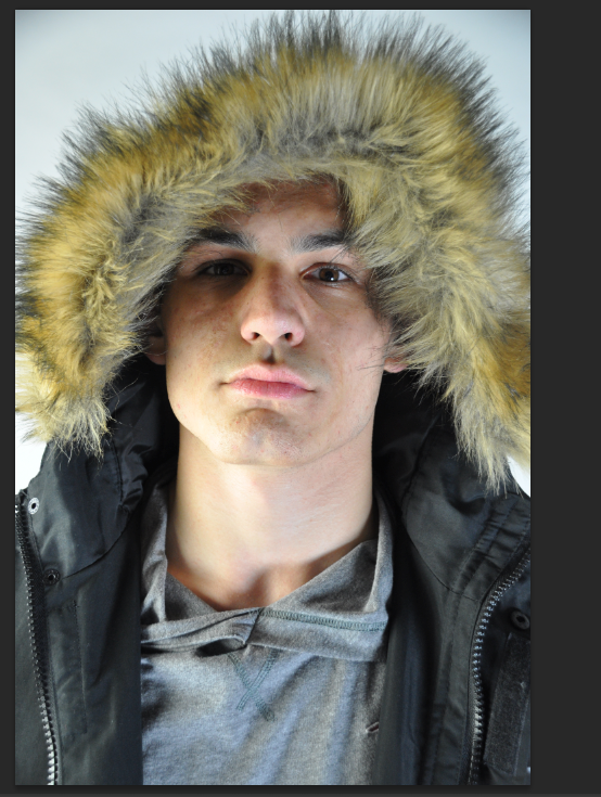
This here is an original photography of Brandon before editing took place. This allowed me to focus on the flaws that are on his face this is a typical convention that is carried out in fashion editorials, editing process. the reason for the changes of the original image was to make the image appear more professional and smooth to my main targeted audience. Also the changes of the image followed by me changing the levels of the contrast bar and the brightness scale of the image seeing as it is to bright. this makes the lighting to harsh on his face therefore by reducing the levels by using the adjustment too bar helped me to convey a clear and smooth image for my regional magazine.

In the editing process of Brandon’s face I decided to look at him and inspect what I need to do so that he will appear smooth without becoming fake. For example I used image and pressed the adjustment page that then presented me with tools that I could use to make this image appear much better for my magazine cover. I experimented with the brightness and contrast levels of the image just to see what will work well for the image if the model. At some points I lowered the brightness levels on the models face as the harsh lightening, highlighted the flaws on his face that didn’t appear smooth to the naked eye. So by reducing the levels it helped to make the image appear smoother already as well as the image not appearing so harsh. Another reason why I changed the brightness and the contrast levels to the models face was because of the environment that he was in. to be specific the background of is white therefore it makes the model appear white and ashy in the foreground as the background is already high in colour.
Secondly, I used the smidge, burn and sponge tool to again to edit the appearance of the models face the reason why I done this is that the editing process as this is a typical tool that is used in magazine, so that they can enhance the features of the subjects. I wanted my model to have the alpha male look to help reflect his status, which is often seen in the male or women magazines. To conclude with this outcome, I am very happy with the images as I took a range of photos that could easily be of the front covers of the regional magazines.

On the other hand I decided to look at the image more closely, so I decided to change the frequency of the levels of the image such as the image being in colour. I decided to change the current levels of the image so that the picture will appear black and white. The reason why I chose to do this was because I thought that the black and white image of the model appeared much more professional and clean so I decided to test the coloured image with the black and white one on each front cover to see what outcome appeared better. In the end I came to the agreement that the images of the model in black and white appeared so much better and professional standards for my regional front cover.
All in all, both images to appear more old and mature for my regional magazine as my target audience appear to a audience of teenagers and young adults. I done it this way as I wanted the images to be able to catch the readers attention as well as the image appear intriguing for the target audience.
No comments:
Post a Comment