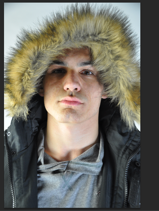
I decided to make a contact sheet to show my progress of my studio shoot for my regional magazine. by doing this I have progress and I am now able to be focus on particular sections of the photo-shoot so that i can grasp meaning for mown regional magazine.
Wednesday, 11 March 2015
Evaluation- My analysis on final images
This here is an original photography of Brandon before editing took place. This allowed me to focus on the flaws that are on his face this is a typical convention that is carried out in fashion editorials, editing process. the reason for the changes of the original image was to make the image appear more professional and smooth to my main targeted audience. Also the changes of the image followed by me changing the levels of the contrast bar and the brightness scale of the image seeing as it is to bright. this makes the lighting to harsh on his face therefore by reducing the levels by using the adjustment too bar helped me to convey a clear and smooth image for my regional magazine.
In the editing process of Brandon’s face I decided to look at him and inspect what I need to do so that he will appear smooth without becoming fake. For example I used image and pressed the adjustment page that then presented me with tools that I could use to make this image appear much better for my magazine cover. I experimented with the brightness and contrast levels of the image just to see what will work well for the image if the model. At some points I lowered the brightness levels on the models face as the harsh lightening, highlighted the flaws on his face that didn’t appear smooth to the naked eye. So by reducing the levels it helped to make the image appear smoother already as well as the image not appearing so harsh. Another reason why I changed the brightness and the contrast levels to the models face was because of the environment that he was in. to be specific the background of is white therefore it makes the model appear white and ashy in the foreground as the background is already high in colour.
Secondly, I used the smidge, burn and sponge tool to again to edit the appearance of the models face the reason why I done this is that the editing process as this is a typical tool that is used in magazine, so that they can enhance the features of the subjects. I wanted my model to have the alpha male look to help reflect his status, which is often seen in the male or women magazines. To conclude with this outcome, I am very happy with the images as I took a range of photos that could easily be of the front covers of the regional magazines.
On the other hand I decided to look at the image more closely, so I decided to change the frequency of the levels of the image such as the image being in colour. I decided to change the current levels of the image so that the picture will appear black and white. The reason why I chose to do this was because I thought that the black and white image of the model appeared much more professional and clean so I decided to test the coloured image with the black and white one on each front cover to see what outcome appeared better. In the end I came to the agreement that the images of the model in black and white appeared so much better and professional standards for my regional front cover.
All in all, both images to appear more old and mature for my regional magazine as my target audience appear to a audience of teenagers and young adults. I done it this way as I wanted the images to be able to catch the readers attention as well as the image appear intriguing for the target audience.
My mock ups for regional magazine
Examples mock ups for regional front cover
This is the original image of the male model Brandon, and I decided to not use the original concept and decided to change the levels of the colour of the images and to produce it into the black and white image that is my final outcome of my media product; which is a regional magazine.
These where extra examples of my regional magazine front covers that I decided to see what colour’s would help stand out and make the cover of the magazine the best it could be. However the yellow title page of the magazine ‘Urban’ helped to bring out the front cover image of my male model, as it brighten up the cover line, straplines and the tag lines of on the front cover. On the other hand, the yellow masthead and subheading of the cover magazine takes away from the London feel of the regional magazine that I was trying to convey in my magazine as it is targeted at people who live in London in our local areas.
This is the original image of the male model Brandon, and I decided to not use the original concept and decided to change the levels of the colour of the images and to produce it into the black and white image that is my final outcome of my media product; which is a regional magazine.
These where extra examples of my regional magazine front covers that I decided to see what colour’s would help stand out and make the cover of the magazine the best it could be. However the yellow title page of the magazine ‘Urban’ helped to bring out the front cover image of my male model, as it brighten up the cover line, straplines and the tag lines of on the front cover. On the other hand, the yellow masthead and subheading of the cover magazine takes away from the London feel of the regional magazine that I was trying to convey in my magazine as it is targeted at people who live in London in our local areas.
In this other issue of my regional ‘Urban’
magazine the master heading and subheadings of the front cover are in green,
this colour didn’t work for my editorial piece as the colour appeared to be
dull, lifeless and took away the concept of my main focus of the male model. The
bold letter and font of the text, helps to bring the cover to life, as it is in
capitals it is easier for our target audience to see as it is in your face.
This works better as it another layout I presented the front cover with a
smaller font size for my master head that hinder my media concept as it
appeared cheap, brittle and weak that didn’t help make my magazine cover stand
out at all.
Therefore, I decided to change the layout font to a much bigger
size in the font ‘Lemon and milk’ which I then duplicated a layer of the master
head in the colour black so that I could create a shadow as well as formulating
a stronger and professional master head for my regional magazine. All in all
this made the outcome of my magazine cover appear much better in size and the
quality of my work is better as it is up to a high standards that felts both
the fashion and regional magazine elements.
Evaluation -My double interview spread
Double Interview spread evaluation
The pictures that
are represented along the top of the double spread intervire page, allows the
reader to get an insight into the artists personality, it may out the reader at
ease with the artist. It also show the fun side yet the serious side of the mode
and the background knowledge of Brandons lifestlye in London. The artist name
appears in the fonr zise 100 and the font style of ‘Lemon and Milk ‘ that it
bold and eye cathching this again draws
the readers attention to that section because the name contrast against the
white background as well as the black writing. All in all the audience will
instantly know who this article is about just by reading the title of the
interview page seeing as it is a summary of the artist. The arisit is not
making full eye contact wit hthe audience, which will draw them int to the main
image as a means of them wanting to know what is wrong with the artistic.
However his pose could also suggest that he is not making eye contact to hide
his identity a little bit seeing as he has done a full blown interview with the
interviewer and is shying away from the camera. This could also show that he is
a shy guy and is new to the limelight seeing as the male model is still in
school whilst trying to juggle his current job as a fashion designer in England.
The fact that this section of the text is in
bold black writing, with a larger font, makes it stand out more against the male models coat. The reason for this is that I wanted to highlight the
importance of the models quote that is
in the interview, the reason for this I because I wanted the readers to be able t come across
the quote of the model so that they are more interested in what he is going to
say within the article.- it attracts the reader to the man source and the most important parts of the texts.
The connotations of the colour red and white
and black reflect the fire, sexiness and charism of the male model. Which may
represent his personality. What the male is wearing also shows
that he is fashionable by wearing British clothing labels such as
‘Supergroup’ and 'Arcadia' sources helps to attract our target audience of an
C2DE audience seeing as the clothing is so mainstream as well as
affordable clothing for the audience.
Also it allows the audience to be up to date with the latest trends fr
the different seasons.
The
bold back front contrast with the white background that allow it to stand out. Also the subheading in the font 'Lemon/Milk' emphasizing the headings 'Northworthy' font.
The
casual surroundings make photos look more relaxed and relatable.
Here
I used drop a capital letter so that I could highlight were the interview
begins. This is a conversation used magazine double spreads, as it helps the
reader to navigate around the page. This also gives a clear understanding where
the interview starts, preventing confusing for the readers.
The
use of slug s a common feature in a fashion editorial. This is presented at the
top on the A4 interview page. This helps the layout of the page as it appears
organized and structured this follows the conventions of a regional magazine.
.’BRANDON RANA MCCARTHY’ is in a different colour to help indicate that we are
getting ‘up and personal’ with the teenager and fresh talent fashion designer.
The
largest text on the page is the ‘interview’ titles this easily grabs
the readers attention. It is also a different look to most interview pages as
they would normally have their model or artist name appear on the image above
their image. But I didn’t want to follow that same convention as an editorial
magazine cover but to focus on the regional aspect side as by having a simple
and relatable title sticks out to the reader more without over complicating
things. It is also in a different font size and font from the rest of the
interview as it helps to contrast with the background much better. Also the
font of ‘interview’ helps to reflect the young and edgy feel of the youths of today’s
generation, as it gives the audience an understanding that the interview will
be edgy and fun.
We
have conventionally had the page numbers at the bottom corner of the page
allowing helping easier navigation for the reader. We also have the magazine
master-head name which is a convention of magazine that they are reading it
also helps to, make the magazine memorable as well as catchy to the readers of
teenagers. This helps to create brand value as well as respect and loyalty from
the readers.
Here we have used a conventional pull quote
that adds interest to the feature. This technique used in many magazine to catch
the readers attentions as to what the content is about this is common in
‘Vogue’. The overall intention here was to make the features seem ambiguous, as
we know that he is fresh talent that I starting a career in fashion therefore,
the reader would want to find out more by reading the feature.
The main image on the interview page is different to the image on
the front cover. This helps to make the artist seem versatile, unique and full
of style, this is shown trough different camera angles. This is important as it makes the artist relatable to our aimed target audience of teenagers tat
live in the local area. The colour scheme of the image is continued on the
front cover page layout, which is mainly made up of white and black. The white symbolises purity and safety of the local area that we live
in showing the innocent teenagers in the magazine. This reflects the values
and the incredible young talent. Our first stand out is unconventionally in
the middle of my page layout, and is also unconventionally very short. This
also helps make him look relatable my target audience of young adults and
teenagers.
The
feature was an interview about fashion where I asked the fashion model on his
career and how he is juggling schoolwork. The tag questions where in big bold
font of ‘Lemon and milk’. This is important as I needed to make it clear to
the audience as the text is in capital letters as it is able
to communicate to the audience easier.
Subscribe to:
Posts (Atom)